Have you ever looked at a cracking animation and wondered: How did they achieve that handmade look? Did they really cut out 1,000 pieces of paper? I want to know their secrets! Well, you’re in the right place.
(Although we can’t give away all of our secrets – we’d be here all day…)
Many of the animations we create here at Alive require that perfectly imperfect look, whether they’re styled after children’s drawings or (supposedly) made from ripped pieces of paper, brimming with texture. Here are the key methods we use to create them…
1. Emulating hand-drawn (or cut) elements 
One of the simplest ways is to fake it. We do this by overlaying multiple effects onto our computer animation to simulate a hand-drawn or stop motion piece, with the goal of making everything a bit wibbly-wobbly.
We drop the frames per second from 25 to 12 to reduce the smooth motion often created with computer animation. We also use an effect called Turbulent Displace to make everything a little bit rough around the edges. When used subtly and correctly, this works really well for making outlines and curves less perfect, or giving the effect of ripped paper/cloth/other materials. If we’re simulating stop motion, we might also make some elements shuffle around a little bit using what we call a ‘wiggle’ so they’re never perfectly still, to emulate how things may get nudged slightly every time a photo is taken when creating a real stop motion piece. We used all of these methods to animate our new Alive Academy course.
2. Actually hand drawing elements 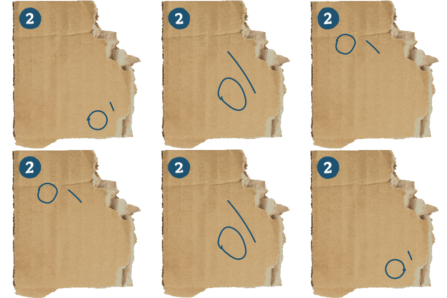
Of course, nothing beats the real deal, so when we get the opportunity it’s always fun to break out our digital pencils and draw individual frames. Although this is more authentic than faking it, it requires a lot of time and work – creating 30 seconds of frame-by-frame animation requires 360 drawings. Not the most ideal, especially as changing that animation later would be far more difficult than editing a computer-generated one. This is why we often mix and match methods 1 and 2 so that our animations feel authentically handmade while maintaining control and editability – which is exactly what we did for our most recent animation for National Energy Action.
Our wonderful illustrator Kat drew some fully frame-by-frame sequences and drew a few frames of other elements which we looped and used throughout the animation.
3. Texture, texture, texture 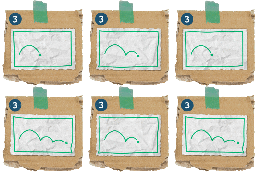
So everything is a bit wibbly-wobbly or it’s been drawn digitally frame-by-frame, but if the background is a pure white void, it won’t look realistic either way. This is where texture is key. Using scans of paper, card and cloth can be very handy here – we make sure to use multiple scans of these textures or flip/shuffle one around so that there isn’t just a static texture, as this doesn’t look the most believable.
Adding a little noise and grain, and some shadows to really sell that these pieces of paper are sat on something rather than everything being completely flat, also adds realism. Depending on the situation we might want to add in some blurring around the edges of the frame to simulate camera focus too.
4. The golden rules 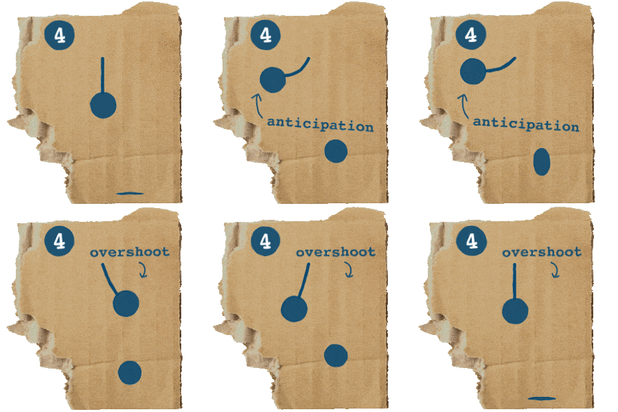
Although this is important for all forms of animation, it’s especially paramount when trying to emulate frame-by-frame animation: using the 12 principles devised by the founding members of Disney. Some of the most important are:
- Anticipation (a smaller movement that happens before another to help the audience expect what will come next, such as pulling back before throwing a punch)
- Follow through / overshoot (how a movement goes a little too far before settling into its final position)
- Squash and stretch (objects getting thinner when moving quickly and being squashed down when hitting into a surface, while maintaining volume)
Employing these principles allows us to reflect the techniques used by frame-by-frame animators when they draw each frame individually, but with computer-generated animation. This is also a great way to create personality in our work and avoid things looking wooden or boring.
5. To blur or not to blur 
Motion blur is often used in animation to simulate a real-life camera capturing movement – camera shutter speeds mean that when a photo (or a frame of video) is taken, it isn’t capturing one single moment in time, so moving things are blurred. However, in stop motion animation, the subjects are static when each frame is captured, so there is no apparent motion blur.
Similarly in frame-by-frame animation, each frame is drawn and so there is no blur. By this logic, we shouldn’t include any motion blur if we’re simulating these techniques… But there may be some cases where we break our own rules, for example if we have lots of pieces of paper on screen and they’re all blown offscreen, it might sell the realism of the motion itself if there’s some motion blur.
We’ll talk keyframes with anyone so would love to hear any thoughts or questions you have – drop us a line at hello@alivewithideas.com
By Em Green


